

Welcome to our one more new article! If you are not new to this website, then you know through a series we are trying to cover every detail of Google Analytics 4 (GA4).
Today, in this article, we will discuss one of the most important sections of GA4, and this is the Exploration Section, and in particular, we will explain in detail how you can use the free-form report technique of this section to create great data scenarios for your business.
This free-form report is the most useful reporting way when you need to see custom data outside of the standard reports. It gives you the freedom to organize your data in your own way.
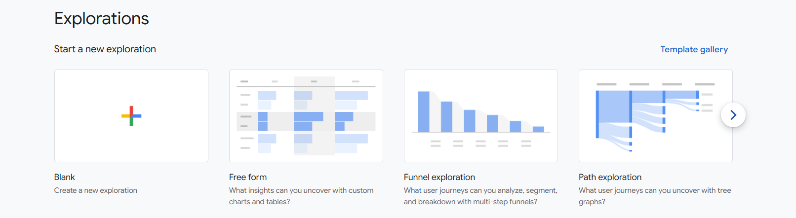
Here in the explorations section from GA4, you will get 7 different types of reporting ways, and every one has their own placement where they can work better than others. But here in the first position you can see our targeted reporting form, “Free form.”
One by one about other forms we will talk later, but for the time being let’s start using the free form.
GA4 Free Form
If your target is to quickly analyze your data with custom tables or charts, then free-form reports might be the best solution for you. Where you can add specific dimensions and metrics of your choice and perform comparative analysis between them.
For example, you can easily organize how many users came from a specific campaign and what their conversion rate is in a table or chart.
Also here, one of the biggest advantages is their flexibility. Because this is the place where you can organize or decorate your data not only in table form but also in different formats according to your needs:
Table: To see the data in detail.
Pie Chart: If you want to understand the proportions or percentages of different segments.
Line Chart: To see changes or trends in data over time.
These amazing visualization features will help you quickly find real insights within the data according to your selected way, which will help you to make your marketing decisions more accurate.
Let’s start the exploration of the free form report section.
Explore GA4 Free-Form reports
To start the report making with GA4 free-form reports, click on the free-form section or in the blank section.
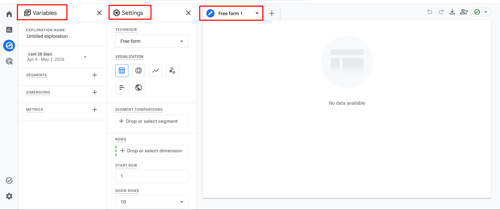
Great, now we are in the free-form section. After entering the report section, first it’s important to understand the settings, and here you can see the interface divided into three different sections.
- Variables.
- Settings.
- Report chart.
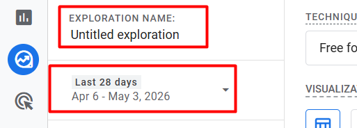
Let’s explore them one by one. But at the start, don’t forget to choose one name and select the date range where you want to analyze your data.
Variables
The Variables section within a free-form report is the place where you select the data you need for your report.
You can think of the Variables section as a ‘placeholder.’ It works like a storeroom where you can store all the dimensions, metrics, and segments you need.
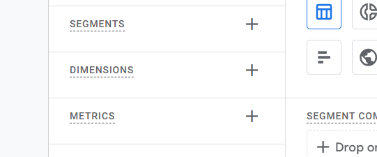
In our previous article we already explained the meaning of these three sections, so if you don’t know about them, you can read our previous article.
But if I explain the three things one more time, then it will be like this: Segments mean who, dimensions mean what, and metrics mean how much.
So, here we have already discussed what segment, dimension, and metric actually mean. Now, we have to select some data from here, so let’s select all of them from these three categories for our next step, with which we will create a complete report.
Here our first step is to select a segment. As we know, “segment” means “who.” That is, we have to decide here whose data we want to analyze.
For our report today, the answer to “Who” will be – Organic Traffic. We will specifically analyze the behavior of only those users who came to our website through organic search.
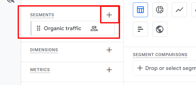
After successfully setting up the segment, now our next task is to select the dimension. As I said earlier, “dimension” means “what.” That is, we need to determine from here which characteristics or topics of our audience we want to create a report on.
Dimensions
For our report today, we will choose two specific dimensions as the answer to “what”:
- Country: We want to see exactly which countries our visitors are coming to the website from.
- Event name: What actions or events they are performing after coming to our site.
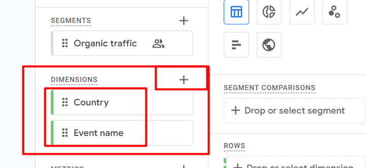
After selecting the dimension, our last and most important task is to select the metric. As I said in the shortcut technique, “metric” means “how much.” So, whenever you want to know the amount of something, you need to select the value from the metric.
In the case of our report, the metric will tell us how many times organic users from specific countries completed the events.
Settings
Great! We have already selected all the targeted data (Segment, Dimension, Metric) required for our report. In this way, you can select your required variables from the variable section. Now, at the time, our main task is to display this data in a complete report form.
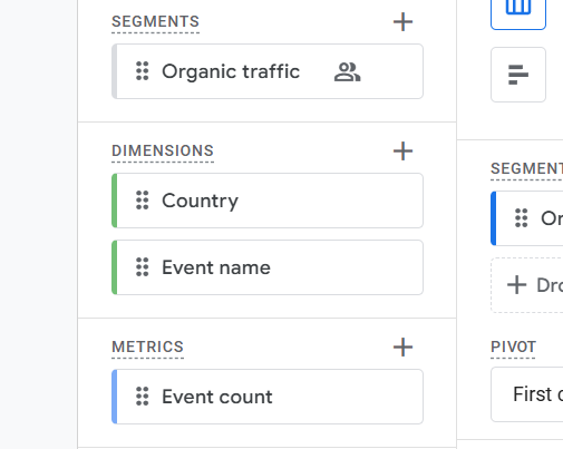
We now need to use the Settings section to display the data we selected in the Variables section in the report. If you think of the Variables section as a “store room,” then the Settings section is your “drawing room,” where you will have to arrange things beautifully and present them to everyone.
So, let’s take a look at how each option in the Settings section works and how you can arrange your selected data here:
Visualization
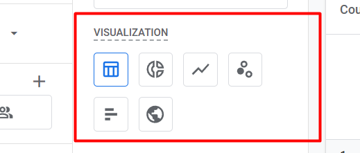
From the first setting under visualization you can select the way you want to visualize your report. Here you will get 6 different way,
- Table
- Donut chart
- Line chart
- Scatterplot
- Bar chart
- Geo map
Segment Comparisons
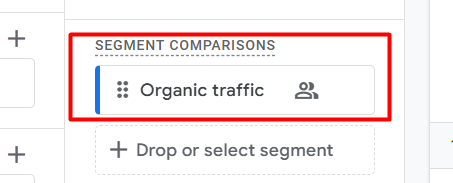
After that, from this segment comparisons section select your segment. You can drag and drop here, or you can also select it just after clicking on the drop because it will provide you the segment list from your variables section.
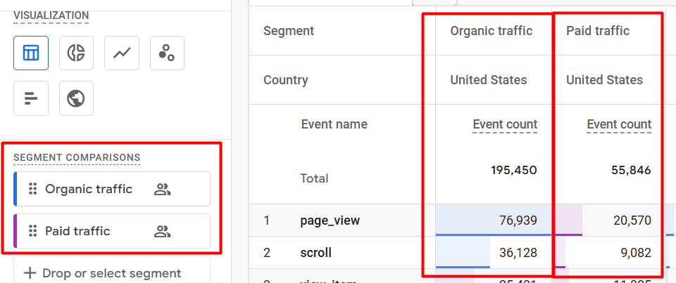
By the way, if you want, you can also select double segments for comparison. If you do it, then your view will be like that in the report.
Pivot
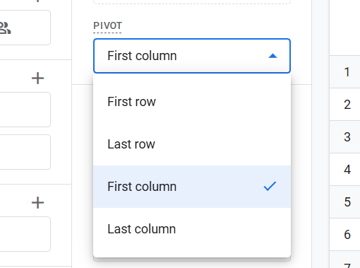
Sometimes when creating reports, the data can seem messy. This is where the Pivot settings come to our rescue. It basically sets the ‘orientation’ or arrangement of our data table.
You can move the dimensions you want to see to the right or left or up or down the table so that even large and complex data looks very clear and understandable to you. It’s like putting together a puzzle where the whole picture emerges in front of you when the information fits together correctly.
Rows & Columns for Dimension
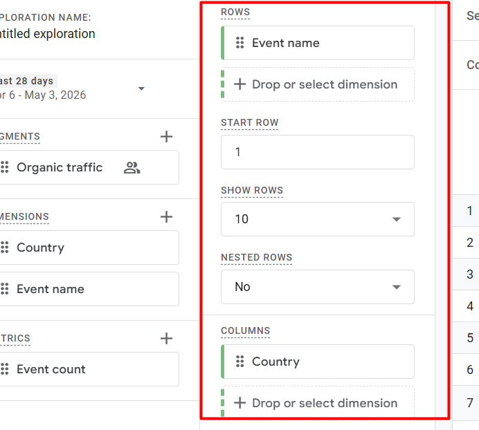
Here the real magic of report creation starts with this rows and columns section. You can call it the skeleton or structure of your report.
When you perfectly place your desired dimensions in these cells, the data comes to life and is presented to you in a beautiful table format. This gives you the freedom to analyze your data from exactly which perspective you want.
Using these two areas, you decide how your report will look. If you want your events to be on the left side and the countries to be at the top, you will need to drag them accordingly.
Show Rows In GA4 Report
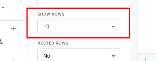
This function basically works like a filter. Through that you can control how many lines or rows you want to see at once on each page or view of your table.
Nested Rows In GA4 Report
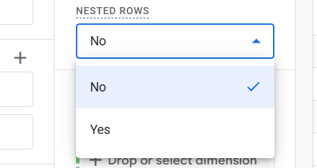
Through this one option you can make your report more organized. Whenever you use more than one dimension in the Rows section (for example, ‘Country’ first and ‘Event name’ below it), setting the nested rows option to ‘Yes’ will make the data neatly arranged inside each other.
Because then, this will show that a country name comes first and all the events from that country are neatly grouped just below it. Look at the image.
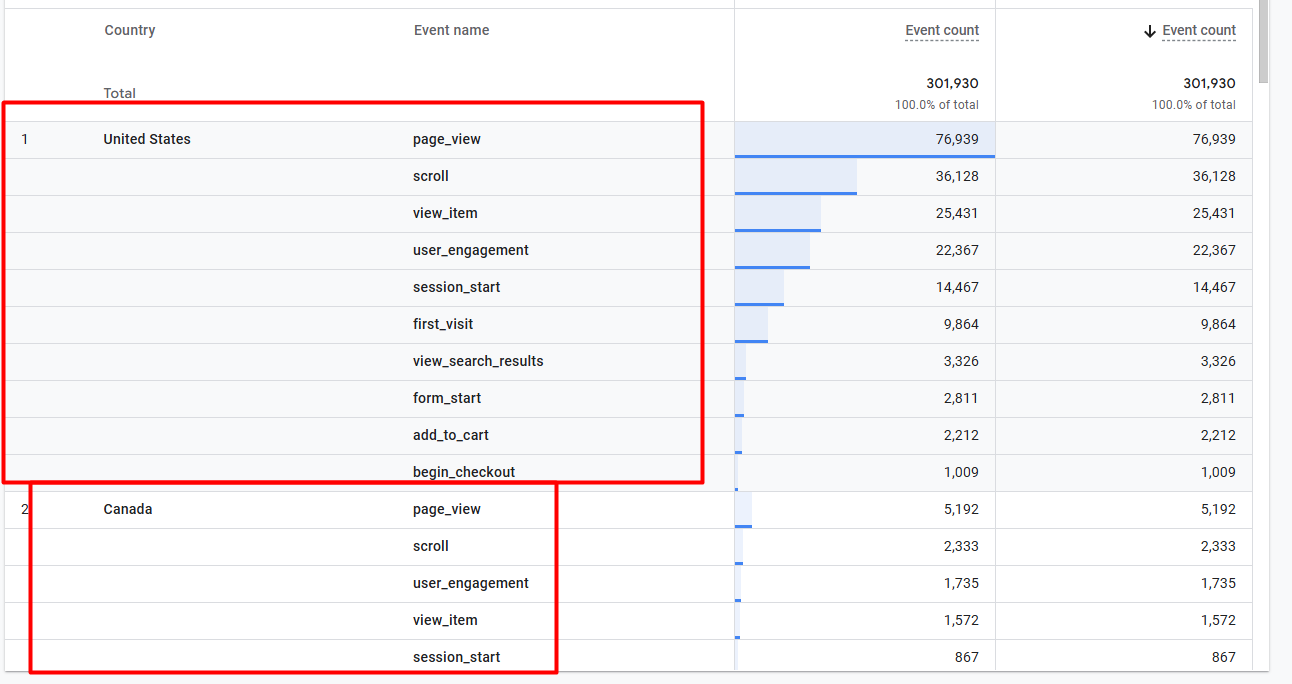
But if you set it to ‘no,’ the country name will be repeated next to each event, which can look a bit messy.
Start row & Start Columns
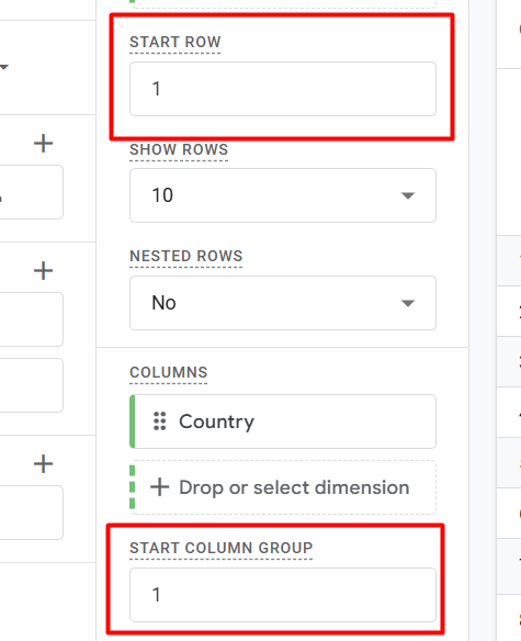
Start Row and Start Column Group are the “starting points” of your report. You can use them when you have a lot of data in your table (such as 500 events or many country columns), and you want to view the data from a specific position without having to look at it from the beginning.
Through the row section you can select from which row you want to start watching your data from, and in the same way you can use the column section.
Value
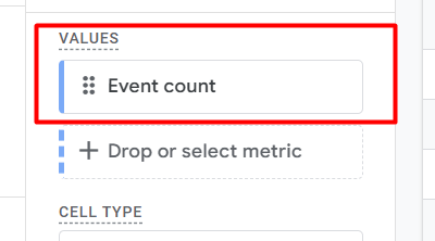
Here in the section you have to select your metrix from the variable section. Great, we already decorate our variable perfectly in the setting section.
You can recheck the setting section where we decorate the setting at the start with the segment, and then in the dimension section we place our dimensions, and then in the last section we place our values.
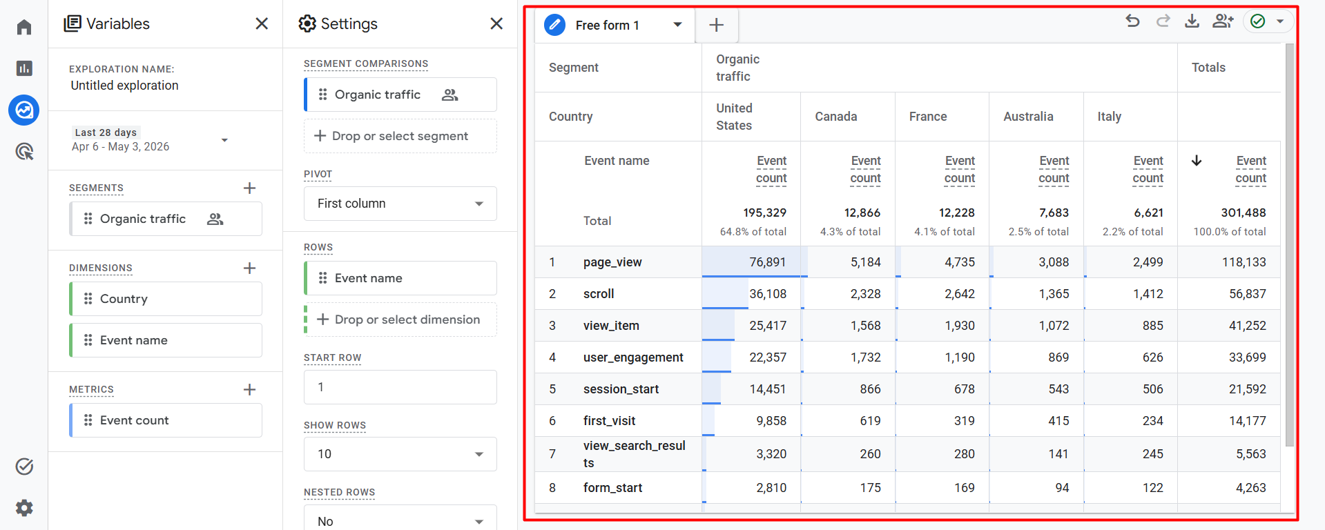
Now your desired results are right in front of your eyes; you can check them! Remember the simple formula; don’t forget it for successfully creating a free-form report:
- First, you will have to select the data you need (segment, dimension, and metric) correctly from the Variables section.
- Then perfectly drag and drop these three elements into the Settings section as you think will be good for you.
- Now use the 3 main areas of the Settings section (Segments, Rows, Columns, and Values) very carefully.
That’s it! Because by following these steps, you will see a nice and meaningful data scenario in your report section.
Cell Type
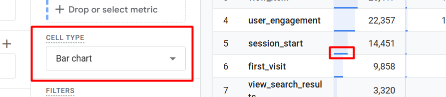
Also, the cell type option is very useful to ensure that the data is not lost in the crowd of numbers after creating the report by you. If you use it, then through this, you can easily visually represent the data in your table.
If you checked the image, you can see that “bar chart” is selected here. As a result, small blue bars are visible next to each number in the table. Here the biggest advantage of using this section is that you do not have to read each number separately; by looking at the size of the bar, you will understand at a glance which event or country has the highest and which has the lowest performance.
Generally, three options are available here:
- Plain text: Will show only numbers.
- Bar chart: Will show graphical bars (which are in your image) along with the numbers.
- Heat map: The background color of the cell will change according to the importance of the number.
One last interesting section under the settings; if you use it, you will love it.
Filters
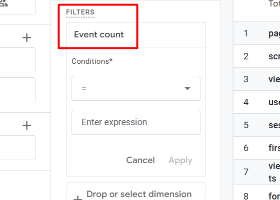
So think of one situation: when we create a report, sometimes we don’t want to see all the data at once. If I give you one example, your report may have many events, and from there some events are very small in number and are not important for your analysis. This is where the Filters setting comes in.
As you can see in the image, at the time, my filter had been set on the event count. Here, using conditions, I can specify the number of numbers above or below which data I want to see.
Also, in this way, if you want to know how a specific event is performing among your selected event names, you can easily isolate it using filters.
Similarly, if you only want to analyze data for a specific country, setting the name of that country in the filter will update the entire report based on that information only.
GA4 Free-form Report chart
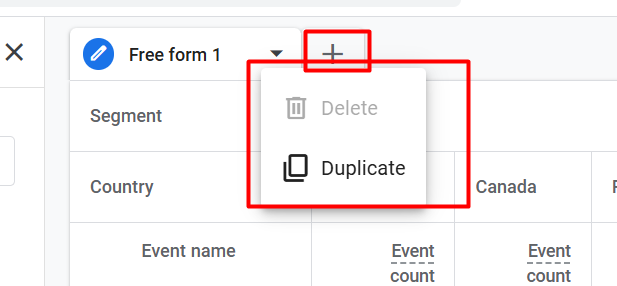
From here you can duplicate your report also. When you have more than one report copy, then you can delete it from here also.

If you click on the icon, then your report will start showing you data from the small amount, and if you click on the place again, then your report will start showing you data again from the larger amount.
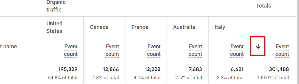
If you click on the icon, then your report will start showing you data from the small amount, and if you click on the place again, then your report will start showing you data again from the larger amount.
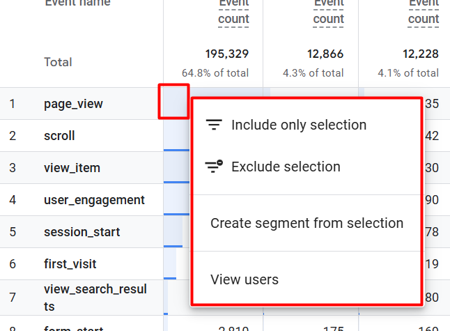
In GA4 reports, we don’t always need to go into settings and set filters. If we want, we can right-click on the report to instantly extract insights if we want.”
Include/Exclude Selection: These two options act as an instant filter. Including the option will show only the selected data, while excluding the option will exclude that data from the report.
Create a segment from a selection: Automatically creates a new segment based on the data you select, without any manual conditions.
View users: This takes you directly to the User Explorer report, where you can view the individual activities or customer journeys of specific users.
At the end for GA4 Free-form
It’s important for you to know that GA4 Free-form report is not just a simple table but a powerful tool for understanding the business performance. We’ve gone through a step-by-step process of selecting variables and then arranging them in the settings section to create an effective report.
Remember one thing: the more you use this tool and experiment with different dimensions and metrics, the deeper you’ll be able to understand your users’ behavior. I hope today’s guide will help you build a solid foundation.
Hopefully, this article will make your Google Analytics 4 analysis journey easier. If you have any questions or are facing challenges with specific tracking, feel free to let us know in the comments.